Blog post
Why You Should Use Visuals to Make Your Data Stand Out

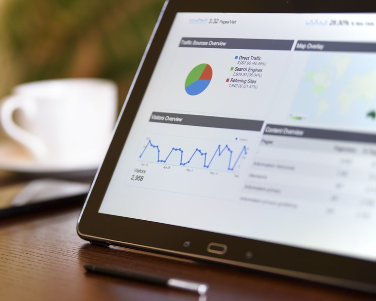
Statistical data may present hard-hitting facts to support a hypothesis or back up a claim, but it isn’t always the easiest or most aesthetically enticing information to communicate, especially during a presentation. Data visualization is an excellent way to not only make sense of statistical data but also make it more accessible to a wider public.
What is data visualization?
According to SAS: Analytics, Business Intelligence and Data Management, data visualization is an invaluable tool “because of the way the human brain processes information, using charts or graphs to visualize large amounts of complex data is easier than poring over spreadsheets or reports.” Therefore, it can communicate quantitative (numerical data), nominal (categorical data) and ordinal (ranked data) in a way that is visually enticing. This is done by using graphs, colour, icons, etc., anything that graphically directs the eye to be able to detect patterns and/or anomalies.
Why use it?
Tina Salameh, a Webster Library Technology Analyst, states that “good data visualization makes sense of the immense of data, narrows it down, and compels you to tell a story.” Furthermore, with the ongoing research involving Big Data, data visualization has proven to be an efficient way to gather insight because of how it graphically displays trends, emerging patterns and relationships.
Getting started
Visual displays for your data can range from simple text, using colour or bigger font to direct the eye, to scatter plots and bubble maps. Tableau is a data visualization software that allows you to drag and drop data and easily arrange it based on your needs.
Before you start putting together your visuals there are several things you should consider.
- The main question you want to answer.
- The data you’re going to use – is it government data from Statistics Canada?
- If the data is easy to use and work with i.e. can use it and manipulate it?
- The correlations – these can be found by asking smaller questions about the data your observing.
- Your visualization – how will you display the data? This also serves as your analysis of the data.
If most of your research involves working with statistics, then you may want to consider investing some time on finessing your data visualization skills. For graduate students interested in Tableau, there is a free public download available which will allow you to create data visualizations and save it onto the Tableau cloud database. You can also attend the GPDI526 - GradProSkills Introduction to Data Visualization with Tableau workshop or visit the Webster Library Visualization Studio.

