Blog post
The Art of Effective Visual Communication

Graphic design can be found everywhere around us – from print-based materials to digital publications, from tiny flyers to entire websites. Even your thesis is an example of graphic design at use. But what do these different materials have in common? They all use images and text to convey a particular message to a particular audience. In other words, they communicate information visually. Yet, not all designs are created equal. Some get the message across in a swift and compelling way, while others fail to do so. This week’s blog post will equip you with six simple ways of communicating your visual messages more effectively.
1. Think of your message
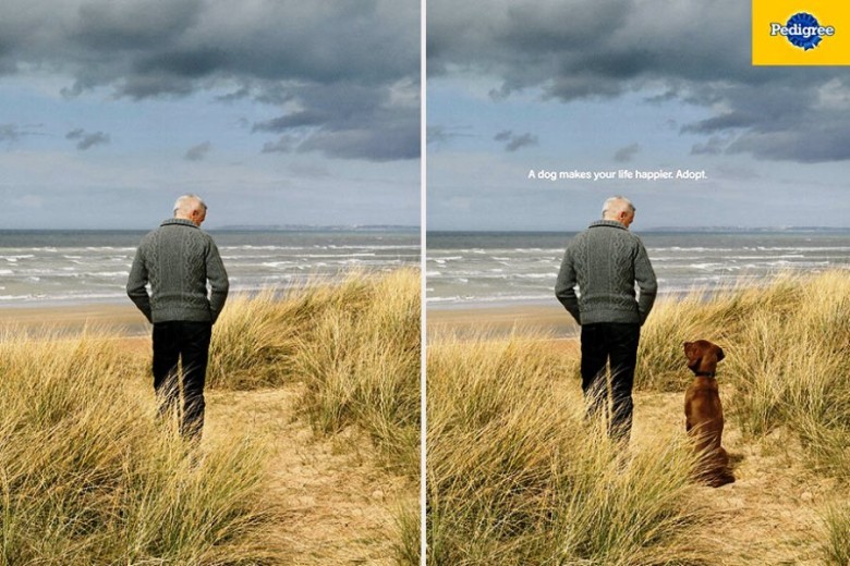
Nothing in an effective design is random. Every element – from the largest picture to the tiniest dot – is there for a reason. It helps you convey the message to the intended audience more effectively. Fonts, colours, and graphic icons can either reinforce or hinder your message, so they must be selected with great care. Random choices, even when beautiful, might distract viewers from your main idea. Let’s practice. Take a look at the advertisement below. Is the design managing to communicate its message effectively? The answer: It depends. If the message is to adopt a dog; then, yes, the design is very effective. If the message is to buy this particular brand of dog food; then, we might encounter a problem – the message might get overlooked, because the audience is focused on the photo.
 Image source: emgn.com
2. Choose the right fonts for your medium
Fonts generally come in two types – serif and sans serif. Serif fonts, such as Times New Roman, have little appendages, while sans serif fonts, such as Helvetica – don’t.
 Image source: drmarkwomack.com
The choice of medium is what determines which font type to use. Serif fonts are much easier for your audience to read in books, newspapers, and other print-based materials. Sans serif fonts, on the other hand, are much easier to read on a screen – so they are often preferred in digital publications. Can you think of other sans serif and serif fonts you have encountered?
3. Know that fonts have personalities
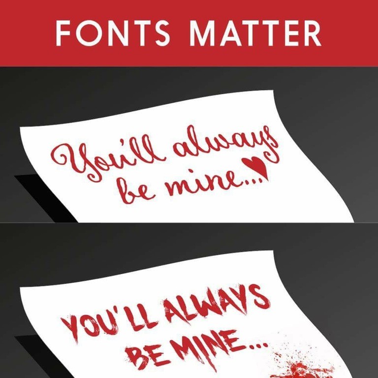
Would you go to a formal academic conference in Bermuda shorts? Our guess is – you probably won’t. Well, similarly, the fonts we "dress our design in" should match the intended message and audience. As a general rule, serif fonts (the ones with the little appendages) are considered more formal and traditional. So it is not surprising that Times New Roman – the font you would normally use for your thesis – is serif. Sans serif fonts, on the other hand, are friendlier and more modern. But there is much more to the psychology of fonts than the division between serif and sans serif fonts. Learn more about the power of font selection by watching the famous Ted Talk by Sarah Hyndman.
 Image source: reddit.com
4. Get your viewers’ attention
Your audience is bombarded with thousands of visual messages every day. Making sure your design is attention-grabbing will help you get your message across even given the fierce competition. How do you do this? Use the power of contrast. The principle of contrast says: If two things in your design are different, make them really different! Check the picture below. Notice how your eyes are involuntary drawn to the contrast area. If the difference in size was smaller, the effect would not have worked so well.
 Image source: bashooka.com
5. Create pleasing compositions
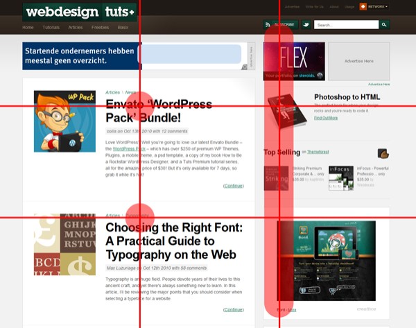
Have you ever wondered why some designs are simply more visually pleasing than others? Well, one way to increase the aesthetical appeal of your work is to use something called the rule of thirds. The rule of thirds says: Divide the design into 9 equal quadrants using 2 parallel and 2 vertical lines (just like in the image below); then, position you most important elements along those lines. By following this composition hack, you can ensure that your design is more attractive to your audience’s senses.
 Image source: webdesign.tutsplus.com
6. Use a colour scheme
A colour scheme is simply a combination of colours that work well together. Using a colour scheme improves not only the consistency and aesthetical appeal of your work, but also helps you get your message across more effectively. There are many types of colour schemes and each is used to support a different message. For example, a complimentary colour scheme is used when you want to add excitement to your design, while an analogous scheme is used when you want to induce a feeling of harmony. Check out this website to learn about the various types of colour schemes and when you should use them. Once you have determined which colour scheme matches your message the best, you can use the free and easy Adobe Kuler to build it.
Extra resources
Now that you are equipped with the knowledge of various design principles and strategies, you can create not only beautiful but also effective designs – designs that can communicate your message to the intended audience in a powerful and clear way. For more design tips, you can sign up for our workshop Graphic Design Fundamentals. And if you want to put your design knowledge in practice, you can sign up for our wokshops in the Adobe software – Introduction to Adobe Photoshop, Intermediate Adobe Photoshop for Graduate Students, and Introduction to Adobe Indesign. Happy designing!

