Sylvie-ouellette is a doctoral candidate in Chemistry/Biochemistry. She received her Bachelor’s in Journalism from Concordia in 1995. In 2017, Sylvie obtained a BSc (Honors) in Cell and Molecular Biology and then joined the Pawelek lab. Sylvie investigates how bacteria scavenge essential iron from their surroundings. Her findings could pave the way for new classes of drugs to contribute to the fight against antibiotic resistance.
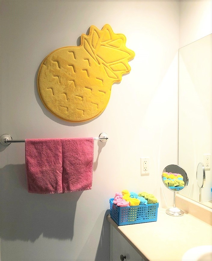 For a very low cost, a choice of accessories out of a tropical palette can enliven the dullest of bathrooms.
When I moved out of my parents’ house, I took with me most of their furniture and various household wares. Not that I was greedy, but they were completely renovating their digs and my mother had decided she wanted brand new items from the front to the back door. Being a student and rather skint, this arrangement suited me just fine. However, most of what I inherited bore testimony to the fashion trends of the era when they had set up their home. As a result, I found myself surrounded by furniture, appliances and accessories in a palette of shades going for beige to drab, with the occasional brown accent thrown in for good measure.
Dullness had entered my life.
In the years that followed, due to budget constraints and the whim of the people with whom I shared my abode, my décor did not improve much on the colour front.
When I got an apartment of my own a couple of years ago, I resolved to include some visual zest into my new home. The previous tenants had repainted not long before deciding to move out, and the cherry-red wall in the living room was a strong attractant in the selection of this dwelling. Most of the other rooms had been done in pale grey, and the bathroom was a pure white canvas. Since I needed to purchase a few items such as rugs, towels and linen, I elected to let my heart guide me. (PIC 1) Today, every room in the apartment has a few focal points that catch the eye and I can honestly say that, far from being over-stimulating, I find all this colour rather soothing.
Why are we so sensitive to colour, and what good can it bring to purposefully surround ourselves with it?
From an anatomy perspective, specialized cells at the back of our eyes have evolved to detect light (rods) as well as colour (cones). While being able to see in dim light is crucial to survival, distinguishing between colours also has its usefulness. At our very core, the animal in us in takes its cue from nature. In summer, clear blue skies, vast patches of green grass and the infinite declination of hues created by sunsets and rainbows signal the brain to rise and get moving (blue and green) or settle down for the night (orange and yellow). In winter, blurry greyness sets in along with a decrease in luminosity, dictating that we should slow down and conserve energy.
The many shades of sorrow
 Monochrome décor may be trendy but does little to lift our general state of mind.
In the Western world, we have now transported our activities indoors and make good use of artificial lighting all year long. But while this light means eternal summer, we sadly fail to carry along the colours that should come with it. In that sense, by following the current fashion trends (PIC 2) we find ourselves in a similar situation as that of our parents and grandparents in the ’70s and ’80s: bland.
From a social aspect, neutral bases are often associated with hospital and industrial settings. Not only are beige, mint green and dusty pink more conducive to relaxation and concentration, the lack of pigments in industrial paint also makes it more affordable. Vast quantities can be purchased cheaply, and the batch-to-batch variations are less noticeable should touch-ups be required.
 This painting by Leonid Afremov at friend’s apartment had caught my eye for its vibrant tones. When my friend moved out of town, I jumped at the chance to purchase it from him.
But there is a time for everything. While many of us may be in need of the quiet, soothing atmosphere brought on by evenness, there is a lot to be said about the value of colour. Bold, primary shades are known to trigger pathways in the brain that arouse attention (PIC3). This goes well beyond the classic belief that green is the colour of hope – or envy, depending on who you were talking to – whereas red is associated with love. Vibrant colours positively affect our mood, without any particular meaning, and therein lies all the benefits to our mental health. At the other end of the spectrum, beiges and browns can evoke masterpieces by the likes of Rembrandt and da Vinci that our subconscious minds are more likely to link to an old, dusty past.
 This painting by a family friend, Gilles Chartrand, makes the best use of bold colours and happened to match my cherry red wall perfectly.
This could be why print versions of works by modern artists such as Dali and Picasso are often sought after when decorating a first home. In my teenage years, my own bedroom as done up in black and white, as were the posters on the walls. Not to say I should have known better, but that was the fashion back then. As for current trends, well, I don’t care. A few years ago, I purchased my first real piece of art from a family friend (PIC4). I was attracted by its bold, vivid hues and it now holds pride of place in my living room. Not only did it enhance my level of well-being at the time, but still today I feel my mood lifted every time I look at it.
So why not add a splash of colour to every room in your home, even if only a small accessory or print on the wall? Try it for yourself – it might work wonders for your state of mind.
About the author