Concordia set to launch redesigned website
Lucy Niro, Concordia’s Director, Web Communications, is enthusiastic about the university’s new website redesign, slated to be launched March 2. The current site is more than three years old. Defining the information architecture and navigation for the new site began in earnest last October. Now, Niro and her team are consumed with final tweaking and testing.
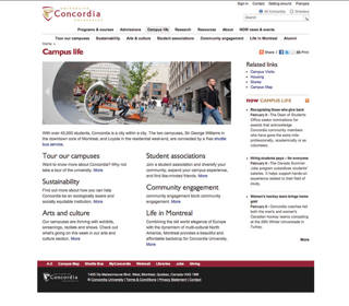
“The operative word is dynamic,” Niro explains. “Our institutional website is the gateway to hundreds of other websites and information and is a major tool for attracting potential students.” Niro said her primary goal is to provide up front the information that users are most interested in. Design choices, information architecture and navigation were based on usability testing reports, analyses of other universities’ sites, and user surveys. “What all this analysis revealed was that a lot of basic information – about programs and courses, for example – was buried layers deep. The topics visitors want most will be promoted to top menu items: program and course information, admissions, campus life, and research,” says Niro.
The new site aims for greater interactivity with vibrant, meaningful images and captions that are part of sliding banners at the top of the page. Usability studies confirm time and time again that visitors scan web pages quickly and use search engines to find information they seek. “The redesigned site still has all the necessary information but it’s streamlined – text is less dense, the typeface is larger, and the two-column layout means less scrolling. As well, a navigational pattern was established and replicated throughout, which goes a long way toward unifying the site, maintaining a consistent look, feel and tone,” Niro emphasizes.
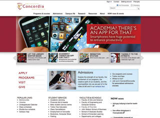
The home page is prime real estate for the promotion of featured news, events, programs, services and resources across the entire university, as well as for student recruitment. “A blue box will highlight whatever recruitment officers want to promote, such as campus tours, the next city they’ll be visiting, open houses, testimonials from current students, and so on.”
The NOW news and event site has also been folded into the institutional website and its news feeds and RSS icons are peppered throughout in the right-hand column. Niro said she’s pleased that “we now have a tuition fee calculator in the new admissions section, something that will be mandatory in the U.S. in the near future.”
Directory-style links, constantly updated based on Google analytics reports, will also provide quick access to must-have information that users want from the home page.
The next step in the redesign process will be to create a mobile version of the site and introduce a new web content management system for the entire university, which will allow for content to be updated by users who aren’t code jocks.
Niro is confident of a successful relaunch but she’s also indulged her conservative streak: “All you can count on in this world is death, taxes and technical glitches. That’s why the relaunch is happening the day after the deadline for new student applications for the fall semester.”
Please see a preview of the new site.