
Status bar
Use the status bar when you need a full-width inline alert with type, title, body, and optional link.


Live demo
The status bar is an inline strip that tells visitors something important about this page or their action (success, information, warning, or error). It stays in the document flow (unlike a toast), with clear colour, icon, and wording.
Technical behaviour
Authors add Status Bar from the Concordia group into a parsys. The component outputs a single role="alert" region with aria-live="assertive", a sprite icon from the shared SVG set, and configurable container width, side padding, and vertical layout for text and link.
Anatomy
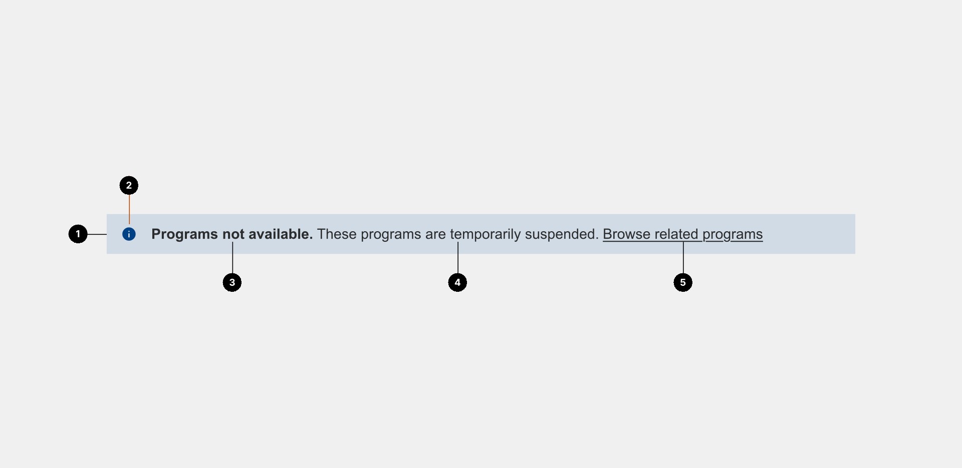
- Root:
<div class="c-status-bar">(from_cq_htmlTag). - Alert:
div.c-status-bar__alert.c-status-bar__alert--{green|blue|yellow|red}plus optionalpx-3,mx-auto, andadditionalClass. - Icon:
<svg class="ci">with<use href="…svg-sprites.svg#ci-…">chosen by status type (see Style). - Inner container:
div.c-status-bar__alert-container.container-fluid.{width}(for examplewidth1200). - Text block: Either a linked main message or a plain message plus optional separate link with label.
(Placeholder asset: show four status types and link variants.)
Content
| Dialog area | Field | Purpose |
|---|---|---|
| Status type | colorClass |
Select green, blue, yellow, or red (maps to icon, background, and icon aria-label prefix). |
| Main text | titleText |
Optional bold prefix followed by a colon and space. |
| Main text | statusText |
Main body copy (HTML from JSP is not escaped in the snippet; use plain text in the dialog). |
| Link settings | link |
Path field; internal /content/… paths get .html appended when not under /content/dam. |
| Link settings | linkText |
If empty and link is set, the main text block is wrapped in the anchor. If non-empty and link is set, the main text stays plain and a second link uses linkText. |
| Link settings | ariaLabel |
Optional aria-label on the separate link when linkText is used. |
| Link settings | linkTarget |
Open in new tab (target="_blank"). |
| Design settings | gridWidth |
Container max width class: width768, width940, width1200 (default), width1600. |
| Design settings | sidePadding |
Adds horizontal padding (px-3) when the bar sits inside page content. |
| Design settings | columnLayout |
Stacks title and body vertically (c-status-bar__alert--column). |
| Design settings | additionalClass |
Extra classes on the alert div. |
When to use
- Short-lived status messages (outages, confirmations, deadlines), policy notices, or calls to action that should read as an alert, not a full Card or hero.
When not to use
- Long-form policy or legal text; use a Text or Accordion pattern with a proper heading hierarchy.
- Non-urgent inline hints; use body copy or a lighter pattern so
aria-live="assertive"does not interrupt screen reader users unnecessarily.
Guidelines
Do
- Match status type to real severity: green for success, blue for neutral info, yellow for caution, red for error or critical.
- When the whole message is a link, keep link text empty so the visible sentence remains the link (dialog field description).
- If you use a separate link label, provide
ariaLabelwhen the visible label is vague (for example “See details”).
Don't
- Don’t stack multiple Status bar components without a clear page hierarchy; consider one banner or a list elsewhere.
- Don’t rely on colour alone; the icon and text should carry meaning (see Accessibility).
Related
| Resource | |
|---|---|
| Icon | Sprite symbols (ci-circle-check, ci-info, ci-warning, ci-error). |
| Alert | AEM Alert component is a different pattern; compare before choosing. |
Styles live under #boot .c-status-bar in status-bar.less. Each status type sets a tinted background, black text, and icon colour for the .ci sprite inside the strip.
Status type mapping
colorClass |
Meaning (dialog) | Sprite id | Icon aria-label prefix |
|---|---|---|---|
green |
Success / confirmation | ci-circle-check |
Success: |
blue |
Information / general | ci-info |
Info: |
yellow |
Notice / advisory | ci-warning |
Warning: |
red |
Error / critical | ci-error |
Danger: |
Design tokens
| Source | Role |
|---|---|
@color-alert-green, @color-yellow-tint, @color-alert-red-tint, @color-dark-blue-tint |
Background fills per variant. |
@color-green, @color-yellow, @color-alert-red, @color-dark-blue |
Icon colour on the sprite. |
--cds-font-size-100, --cds-font-family-body, etc. |
Body and link typography. |
Variants
- Container width:
width768…width1600on the innercontainer-fluid. - Side padding:
px-3on the alert whensidePaddingis true. - Column layout: Flex column for title and body when
columnLayoutis true (stronger vertical rhythm for long titles).
Behaviours
- Links: Underline, inherit text colour (
status-bar.less). - Icon size: Inline
font-size: 1.5remon the wrapper around the SVG instatus-bar.jsp(sprite scales with that context).
role="alert"andaria-live="assertive"announce the region as soon as it appears or updates. Use this component for important messages. Avoid placing it on every page unless the message is truly needed.
Icon
- The sprite
<svg>usesrole="presentation"witharia-labelset to a short prefix (Success:,Info:, …). The visible title and status text should still carry the full message.
Links
- Whole-block link: When only
linkis set, the anchor wraps the visible text; ensure the sentence reads as a clear link. - Separate link: Use
ariaLabelwhen the visiblelinkTextis not self-explanatory.
Keyboard and focus
- Focus order follows the DOM: icon is not focusable; links inside the bar are focusable.
Testing
| Test | Status |
|---|---|
| Screen reader announcement when the bar is added or updated | Recommended |
| Colour is not the only cue (icon + text) | Required |
New tab links (linkTarget): user-visible indication if policy requires |
Review per policy |
WCAG / guidelines
- Understanding 3.3.1 Error identification (when used for errors).
- Understanding 4.1.3 Status messages (live region behaviour).
Related
| Resource | |
|---|---|
| !AEM | Component: apps/concordia/components/status-bar; clientlib: apps.concordia.status-bar. |

CRXDE Lite query
Use this query in CRXDE Lite to find instances of this component.
/jcr:root/content//*[@sling:resourceType = 'concordia/components/status-bar/status-bar.jsp']
- Resource type:
concordia/components/status-bar. - Entry script:
status-bar.jsp(includes clientlibapps.concordia.status-bar). - Markup root class:
c-status-bar(_cq_htmlTag).
Implementation
| File | Purpose |
|---|---|
apps/concordia/components/status-bar/status-bar.jsp |
Builds alert markup, icon use, link branching, optional .html for internal paths. |
apps/concordia/components/status-bar/dialog.xml |
All authoring fields (fieldsets in dialog.xml for Main text, Link settings, Design settings). |
apps/concordia/components/status-bar/_cq_htmlTag/.content.xml |
Root class c-status-bar. |
etc/designs/concordia/clientlibs/status-bar/less/status-bar.less |
Layout, colours, link styles, column modifier. |
Markup structure
- Outer:
div.c-status-bar__alert.c-status-bar__alert--{colorClass}withrole="alert"andaria-live="assertive". - Inner:
div.c-status-bar__alert-container.container-fluid.{gridWidth}. - Icon:
<svg class="ci">+ spriteuse(see Style mapping). - Text: either
<a>wrappingc-status-bar__alert-text, or<span class="c-status-bar__alert-text">plus optional<a class="c-status-bar__alert-link-text">.
Dependencies
- Clientlib:
apps.concordia.status-bar(included fromstatus-bar.jsp). - Icons: Shared SVG sprite (
svg-sprites.svg); see Icon.