Explore the core UI elements used across the system, designed to help you build interfaces quickly and consistently.

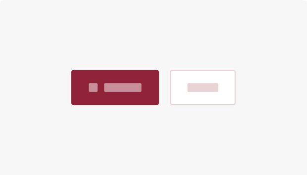
Use buttons when users need a clear primary or secondary action such as submit, continue, or download.
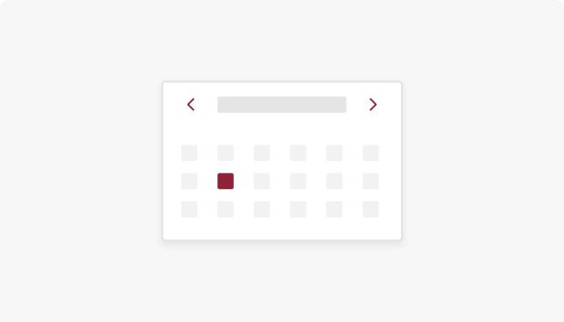
Use the calendar when users need an interactive month grid with search to find events by date.
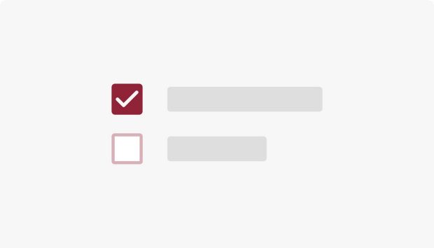
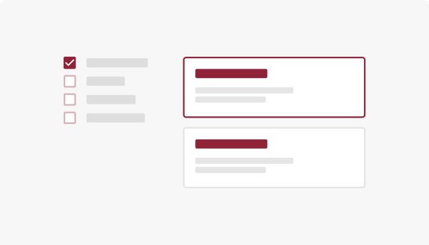
Use checkboxes when users need to select none, one, or many options from a list.
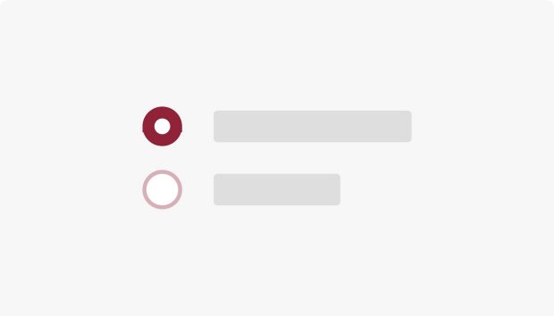
Use radio buttons when users must pick exactly one option from a mutually exclusive set.
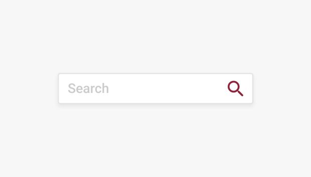
Use search components when visitors need keyword or filtered search across site or list content.
Use a text area when you need a multi-line field for longer answers in forms.
Use Thunderstone faceted search when results need facets with filter UI.
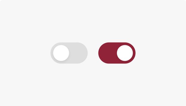
Use toggle patterns when the UI needs two-state controls such as switches or filter pills.
Use this list when you need to display alumni award recipients.
Use featured events when you need a compact list of priority or upcoming events.
Use the gallery when you need slideshows, grids, or lightbox galleries from DAM images.
Use icons when you need consistent SVG symbols or webfont icons for interface affordances.
Use an iframe when you need to embed another page or tool inside the page in a framed area.
Use the image component when you need a single DAM image with size, alignment, caption, and link options.
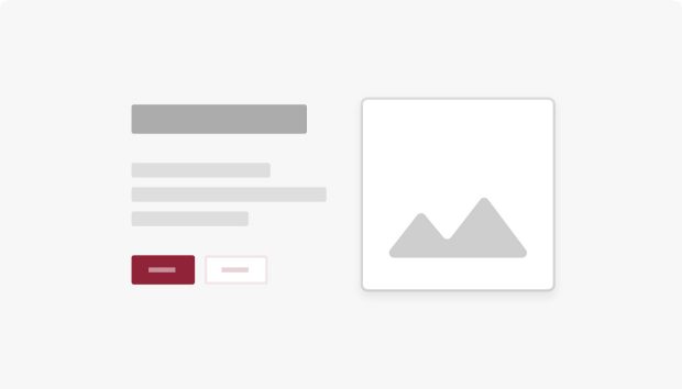
Use image and text when you need paired image and rich text in a two-column layout.
Use the introduction when you need an opening section with title, rich text, image, and links.
Use list related stories when stories need related news items for discovery.
Use the news list when visitors need grids, simple lists, or tag-driven story browsing.
Use social media when pages need official social links and optional share actions in one row.
Use the table when you need authored rows and columns with stripes, borders, and compact layout.
Use the WYSIWYG when you need rich body copy with headings, lists, and links from the RTE.
Use the YouTube component when you need an embedded YouTube clip with caption and layout options.
Use an accordion when you need sections that expand and collapse to save vertical space.
Use the box when you need a container with optional background, border, and spacing around a parsys.
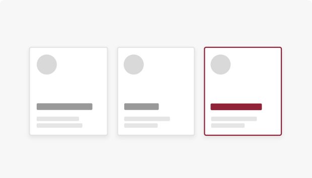
Use cards when you need flexible tiles for related content, actions, and a consistent layout.
Use a card deck when you need multiple cards in a responsive grid with masonry or equal-height rows.
Use a carousel when you need rotating slides with controls or indicators, often for hero content.
Use carousel multi items when each slide needs multiple columns of content side by side.
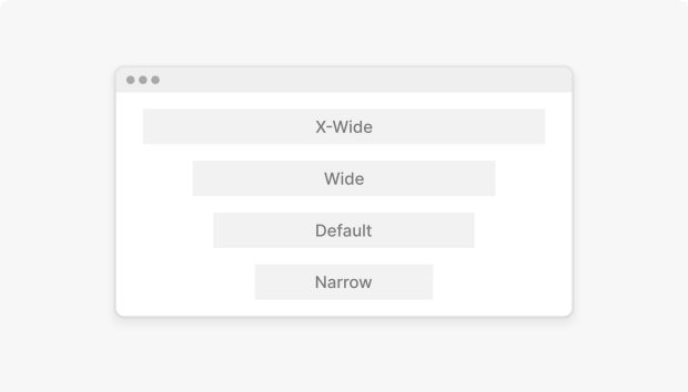
Use column control when you need two to five columns that stack on narrow screens.
Use a grid container when you need section width, background, and vertical spacing between blocks.
Use a hero when you need a large top banner with imagery, headline, supporting line, and calls to action.
Use an offset block when you need long copy paired with a strong image in two columns.
Use a separator when you need a horizontal rule between sections without adding a heading.
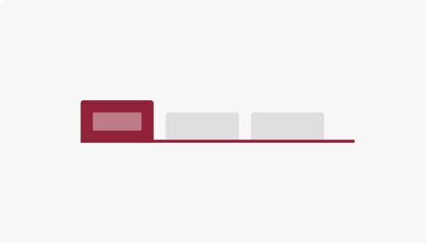
Use tabs when users should switch between related panels without leaving the page.
Use tiles when you need two to four equal-width columns in one row.
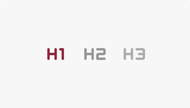
Use the title component when you need a section or page heading with level, style, and optional RSS or link.
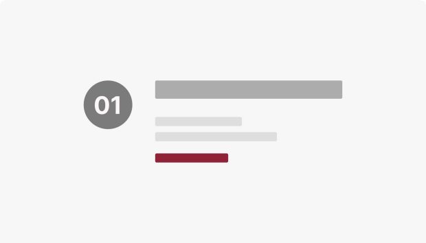
Use a value prop block when you need a headline, supporting copy, and optional links for a program or feature.
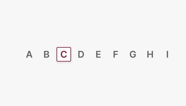
Use an alphabar to quickly filter or jump to content by the first letter, making large lists easier to scan and navigate.
Use anchor navigation when you need an in-page table of contents with jump links to sections.
Use back to top when long pages need a quick way to return to the top, including for keyboard users.
Use breadcrumbs when users need to see where they sit in the site hierarchy as a trail of links.
Use links when users need navigation to pages, files, email, anchors, or external URLs.
Use a link list when users need a compact vertical list of related links with optional headings.
Use pagination when long lists or search results should load in pages instead of one screen.
Use step navigation when multi-step flows should show progress and the current step.
Use last updated timestamp when a page should show its last modified date and time in English or French.
Use pills when you need compact tags for status, filters, topics, or metadata.
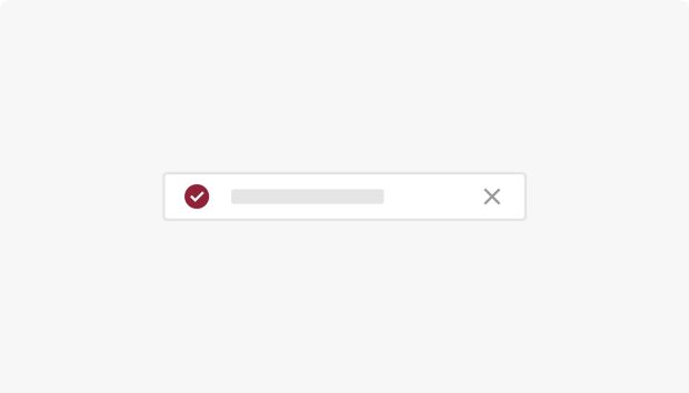
Use the status bar when you need a full-width inline alert with type, title, body, and optional link.
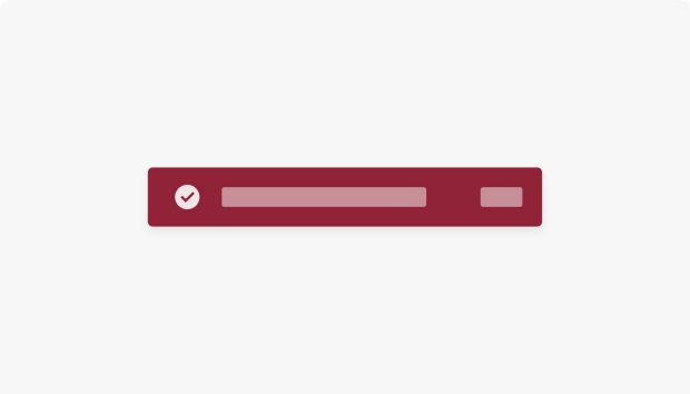
Use the alert when you need a site-wide banner for urgent or breaking messages above the main content.
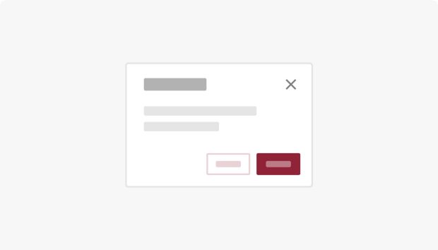
Use a modal when you need focused content or a single task in a layer above the page.
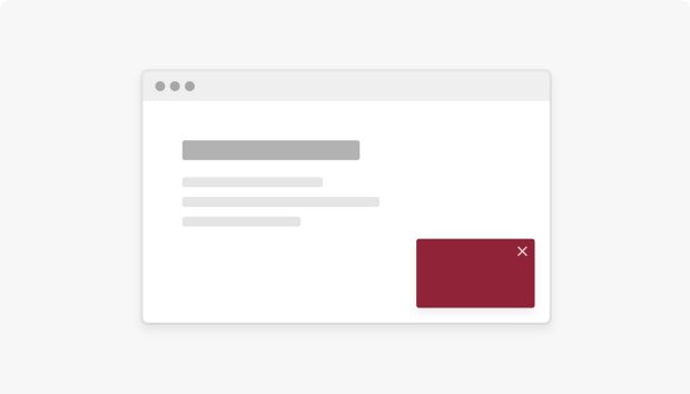
Use the toast when you need a fixed bottom banner for short promotional or contextual messages.
Use tooltips when controls need short hints on hover or keyboard focus.
Use CSS include when you must add edge-case CSS; prefer shared clientlibs and design tokens first.
Use script include when you must add page-level JavaScript; prefer shared clientlibs first.