
Image
Use the image component when you need a single DAM image with size, alignment, caption, and link options.


Live demo
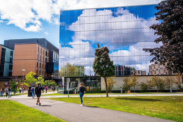 This is a caption
Visitors see photography or graphics with alt text for context. Content authors choose the asset and meaningful alternative text; visual designers set width, float, and full-width behaviour so text and images flow predictably on small and large screens.
Behaviour
- Optional link wraps the image; internal paths are normalized for the site.
- Lightbox and link to full size change what happens when someone clicks the image.
- Float, round, and full-width options change how the image sits next to other content.
Anatomy
- Figure or wrapper with optional link or lightbox hook.
- Image (or adaptive image output from the foundation API).
- Optional caption or credit per dialog.

Replace with default, floated, and full-width examples.
Content guidelines
- Alt text should describe the image’s purpose for the page, not a generic filename.
- Captions support context; credit should follow editorial policy.
Best practices
Do
- Always set meaningful alt; mark decorative images with empty alt only where policy allows.
- Prefer original aspect unless art direction requires cropping in DAM.
Don't
- Don't stretch small logos with fixed pixel widths that blur on retina displays.
When to use
- Inline figures in content where Image and text is not required.
When not to use
- Text beside image in a paired layout; use Image and text.
CRXDE Lite query
Use this query in CRXDE Lite to find instances of this component.
/jcr:root/content//*[@sling:resourceType = 'concordia/components/image/image.jsp']
Technical behaviour
image.jsp generates an instance id, reads Image from the resource, and applies inline width styles from width, scaleToFit, or auto. linkURL wraps the image when set; internal paths gain .html. showLightbox and linkToFullSize alter click behaviour. floatLeft, roundImage, and fullWidth toggle layout classes.
Authoring fields
| Field | Purpose |
|---|---|
| File reference | DAM image. |
| Alt / title | Accessibility and tooltip. |
| Width | Pixels, auto, or scale to fit. |
| Link | Optional navigation or download. |
| Lightbox | Enlarge in overlay when enabled. |
| Layout | Float, round, full width. |
Instances in the codebase
| Location | Notes |
|---|---|
apps/concordia/components/image/image.jsp | Main site image component. |
| Item | Location |
|---|---|
| Component | apps/concordia/components/image/image.jsp |