
Offset block
Use an offset block when you need long copy paired with a strong image in two columns.


Live demo
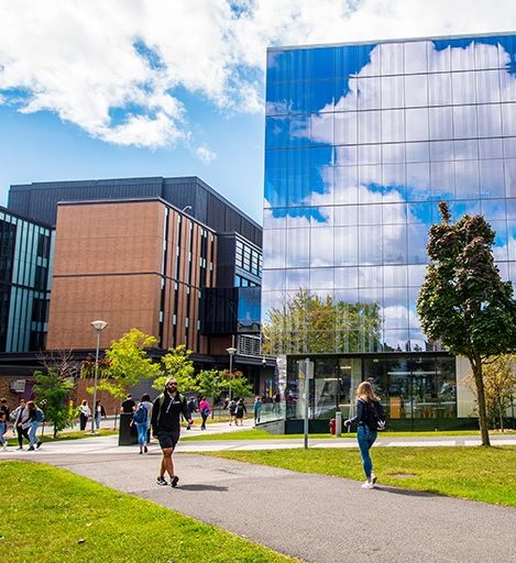
Visitors read a headline and story beside or around a visual anchor (photo or illustration). Content authors balance text length with image cropping; visual designers use ratio, offset, and typography so the block feels editorial and scannable on mobile and desktop.
Behaviour
- Image side and offset presets control how the visual lines up with the text column.
- Buttons map to primary and secondary styles; optional custom colours must stay on-brand.
Anatomy
- Title and body column with optional width constraint.
- Image column with alt, credit, and vertical alignment.
- Actions row when buttons are configured.

Replace with image-left and image-right layouts.
Content guidelines
- Overview copy should support the headline; avoid duplicating the hero above it.
- Alt text and credit should follow DAM and editorial policy.
Best practices
Do
- Provide meaningful alt text for non-decorative images.
- Limit to two buttons per block to preserve hierarchy.
Don't
- Don't use custom button colours outside brand-approved values.
When to use
- Editorial sections where image and copy are equally important.
- When vertical offset creates intentional overlap or stagger with neighbouring sections.
When not to use
- Simple image + caption; use Image and text or Text image if that matches the design system.
- Pure text without an image; use Grid container + WYSIWYG.
CRXDE Lite query
Use this query in CRXDE Lite to find instances of this component.
/jcr:root/content//*[@sling:resourceType = 'concordia/components/offset-block/offset-block.jsp']Technical behaviour
offset-block.jsp includes apps.concordia.offset-block. It builds a responsive row: title and overview use configurable heading level, font family, size, and colours; the image uses DAM metadata for alt text and optional photo credit. Buttons map dialog styles to btn-ghost / btn-ghost-filled classes and optional custom hex fills. Internal links append .html when needed.
Authoring fields
| Area | Purpose |
|---|---|
| Layout | Text versus image ratio, image side, offset presets, text alignment, optional padding tweaks. |
| Title | Heading level, condensed or bold styles, size, colour. |
| Image | DAM reference, alt, credit. |
| Buttons | Label, path, target, style, optional custom colour, aria-label. |
Instances in the codebase
| Location | Notes |
|---|---|
apps/concordia/components/offset-block/offset-block.jsp | Implementation. |
| Item | Location |
|---|---|
| Component | apps/concordia/components/offset-block/offset-block.jsp |
| Dialog | dialog.xml beside the component |
Instance ids: Path-based ids for unique anchors in the DOM.