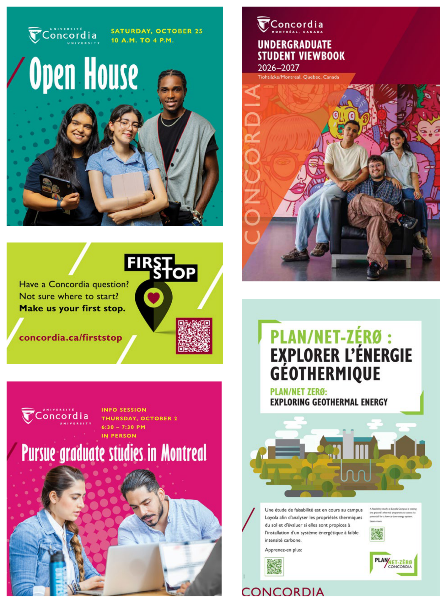
Visual identity
Concordia has developed a look and feel that communicates cool, urban, bold and edgy (CUBe):
- Cool: self-confident; makes one want to be part of that scene
- Urban: energetic; awake; worldly; diverse
- Bold: daring; draws attention; takes charge
- edgy: (dependent on the project and channel, applies only to certain audiences) atypical; on the edge of one’s comfort zone; with attitude
It represents a range of charismatic, vibrant designs that powerfully expresses the university’s brand through thought-provoking imagery; exudes excellence and approachable cool by its clean, crisp professionalism; innovates through energy and style; and engages audiences with a hip, diverse urban edge. This styling will apply across the board, albeit with some unit-specific variants.
The main parameters of this approach are:
- Typography: Bolder, highly expressive typography, often all caps outlined or solid, sometimes playful at angles or along a path; or reversed out of imagery/solid colour/backgrounds
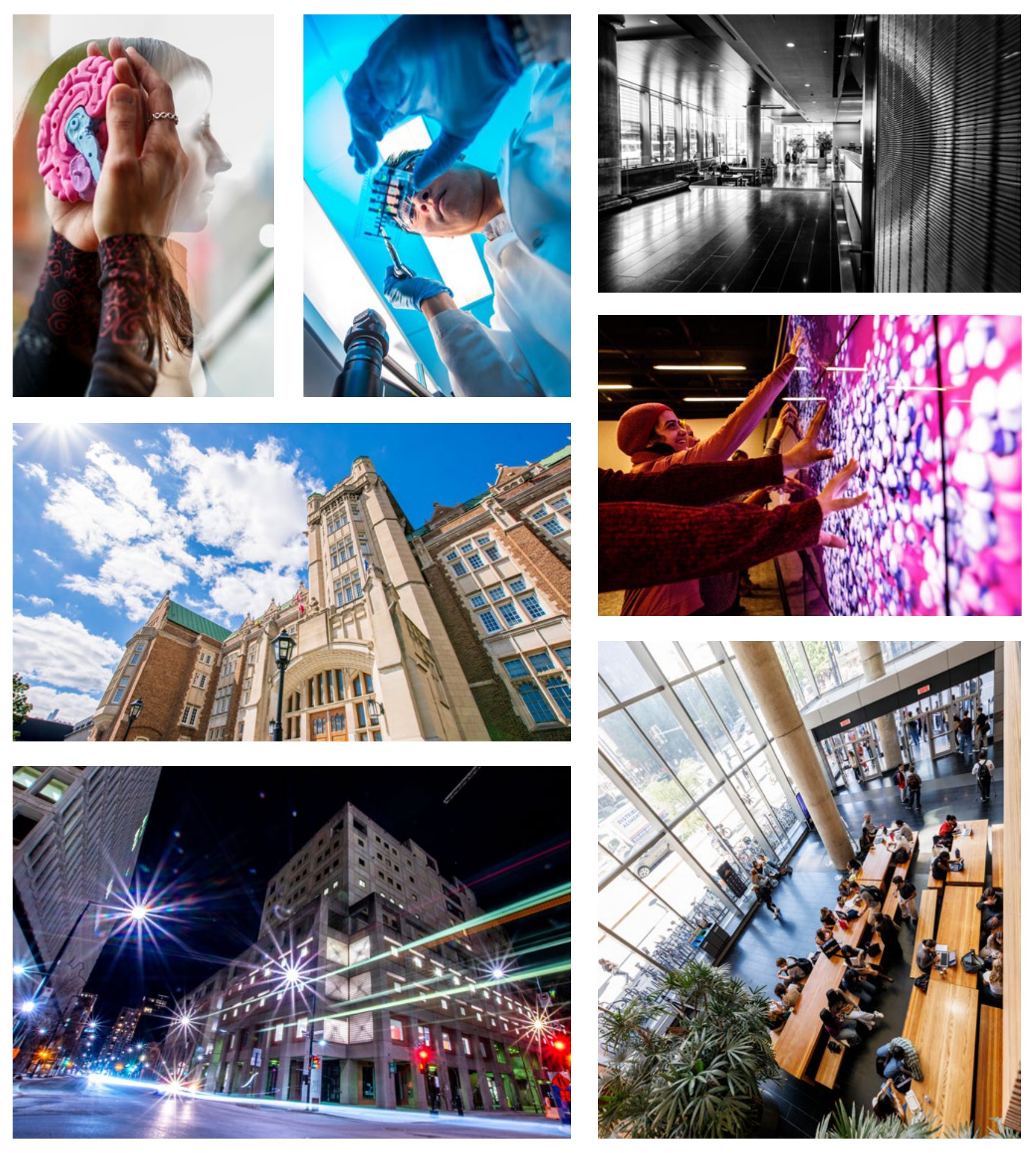
- Imagery: High-intensity vibrant photos, also integrating black and white photography; can include illustration
- Colour Overlays, sometimes gradients; blocks of solid colour; transparencies for depth; revised colour palette, always including some touch of burgundy
- Graphics: ‘CONCORDIA’ wordmark should be included, outlined or with transparency; official logo minimized on back
- Unifier: On print materials, integration of the diagonal element (line, division, etc) or thin outlined wedges for continuity
- clean backgrounds with white space whenever possible
- use of official colour palette, always including some burgundy
- preferred use of 'CONCORDIA' wordmark
- use of official typeface family, Gill Sans Nova, subject to licence permissions
Photography examples
Layout examples